LIFEFACTORY
I led all facets of design and production including: branding, web design, email blast, social post, collateral, packaging and merchandising. There were two rounds of rebranding: first was the implementation of the first rebrand created by a design agency. Second branding was to create a new logo that speaks more to our heritage and the company’s commitment to using the highest quality materials and thoughtful designed products that become the building blocks of living well.
Lifefactory’s original logo lacked sophistication and was aesthetically outdated. The interim logo, which was created by a brand agency, lacks friendliness, does not relate to our product offering, and it lacks an iconic, memorable feel. It was far departure from the brand and the logo did not resonate with our customers base. The current logo was developed to connect back to our roots. The circles resemble a flower which symbolizes rebirth and growth, but also alludes to community and family.
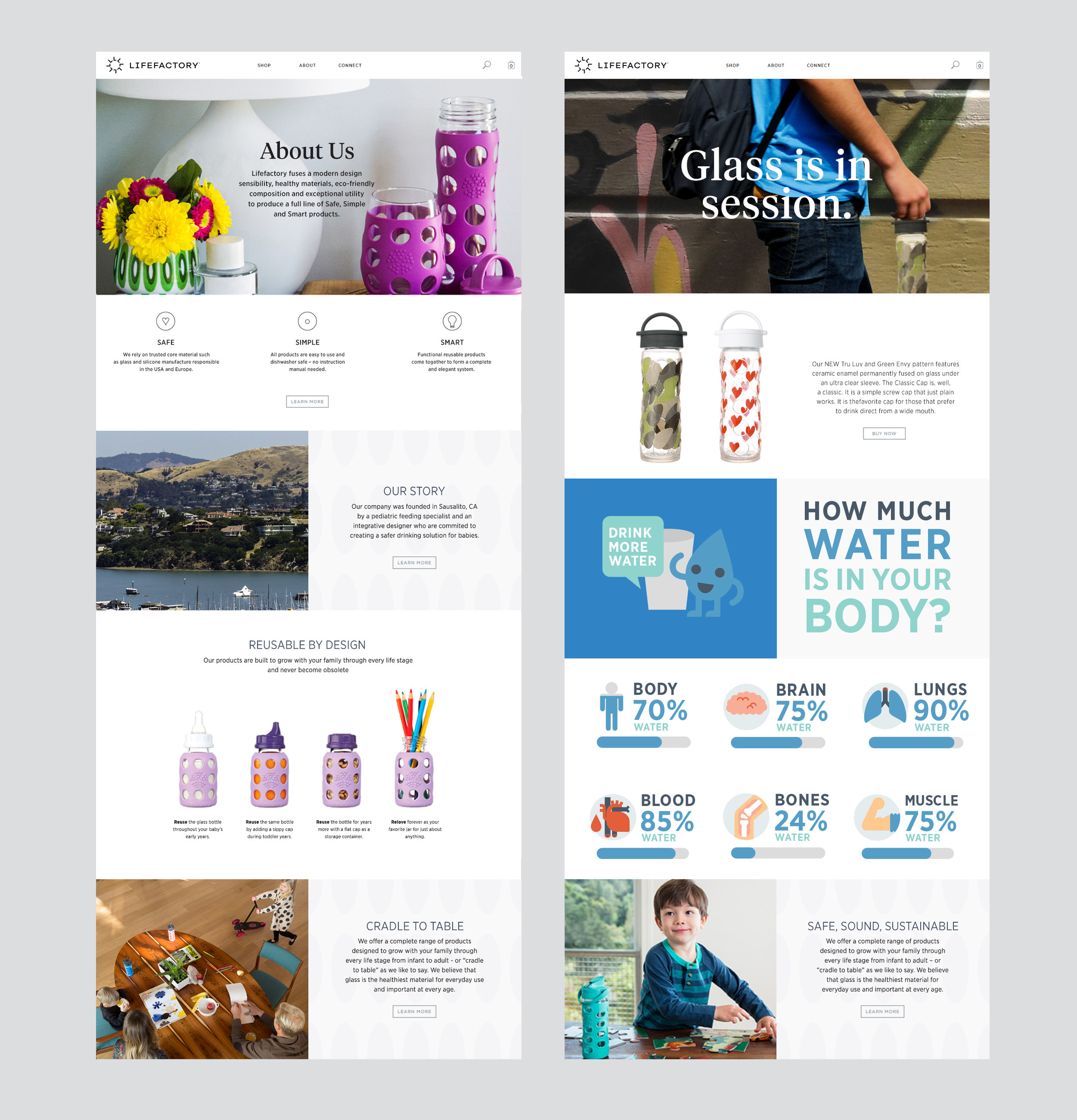
Website landing page homepage design, about us and back to school promotional. The goal was to tell a story about the product through use of photographs that are authentic and infographics that’s fun and educational.
Samples of brand implementation through collateral, packaging and merchandising. Rebranding the second time was necessary as it was evident that the packaging and the logo were disappearing in the store environment, I overhauled the whole packaging and merchandising system for better visibility, for clarity in the price point and for better impact in the stores. Where I was managing 19 different hydration band, I reduced it to 3 bands. In the process I save the company printing cost, storage cost and designed a system that is efficient and effective.


